A vision drawn on empty blue water is easy to dismiss. The central North Sea, however, is anything but empty; our new interactive map is built to prove it.
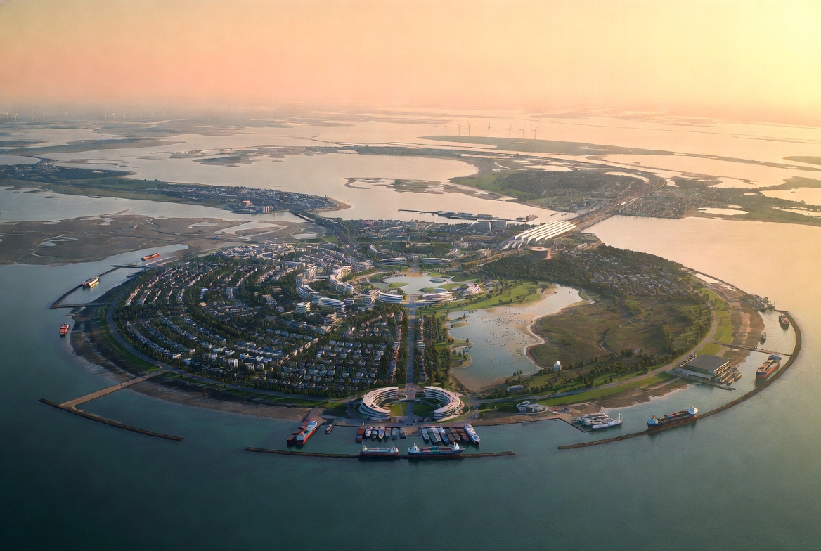
The map plots eight layers of data over the Dogger Bank and its approaches: operating wind farms and their individual turbines, oil and gas fields and rigs, subsea cables and pipelines, ports, and the protected areas that already stitch four nations’ waters together. Over that real, present-day infrastructure it overlays the planned geography of Nieuw Doggerland: the central hub island, the radiating archipelagos, and the causeway line running from Immingham to IJmuiden.
Why we built it
Two reasons.
First, context. The strongest argument for Nieuw Doggerland is that the industrialisation of the Dogger Bank is already happening. The world’s largest offshore wind farm is under construction there now. Interconnectors already cross it. The question is not whether to build in the central North Sea; it is whether to keep building piecemeal, or to build something coherent, beautiful, and alive.
Second, honesty. Plotting the planned islands against real bathymetry and real infrastructure keeps the project disciplined. Every island sits on genuinely shallow bank; every causeway segment respects the shipping lanes and cable corridors that are actually there.
Under the hood
For the technically curious: the map is built on MapLibre GL with the project’s datasets stored as plain GeoJSON. No proprietary tiles, no tracking; everything is served statically from this site. As feasibility work refines the island geometry, the map will be updated in place. It is intended to be the living, canonical picture of what we are proposing and where.
Open the map and start with the turbines layer; the sheer density of what already stands on the bank is the best introduction to the project we have.